Powdertech Stone Finish™ – Complementing Architectural Stone
5 May 2026

Why colour is increasingly considered an integral part of architectural performance, not merely a decorative finish.
Colour is often one of the last decisions made during the design of a building. Plans have been drawn, materials selected and structural challenges resolved before attention finally turns to the question: “What colour should it be?”
Yet far from being a cosmetic finishing touch, colour is an important design tool, helping architects build settings that are attractive, fit for purpose and memorable. It has the power to influence how we experience a space, how easily we move through it, how safe we feel within it and how it blends or contrasts with its immediate environment.
While our emotional response to colour has long been recognised, today’s understanding has gone further, with a good deal of research into this area. Within architectural design, colour is used as an instrument for manipulating spatial perception, accessibility, wayfinding, and well-being. (Jaglarz, 2023) It is no longer simply about aesthetics; it is about developing buildings that work better for the people who use them.
We instinctively respond to colour before we consciously analyse it. It shapes first impressions and influences our perception of scale, warmth and atmosphere. (Canepa et al., 2026)
It is well known that lighter colours can make enclosed spaces feel larger and brighter whilst darker tones may create intimacy or drama. Warmer colours can make expansive spaces feel more welcoming and cooler hues often evoke calmness and openness. (Jaglarz, 2023)
The scientific basis for this is revealed by Functional Magnetic Resonance Imaging (FMRI) research. This shows that warm colours, such as red, activate the amygdala, raising heart rate and alertness. Conversely, cool colours (blue/green) engage the prefrontal cortex, facilitating analytical thinking and preventing mental fatigue. (Wilms & Oberfeld, 2018, pp. 896-914) **
The interaction between colour and natural daylight continually changes these perceptions throughout the day, giving buildings a dynamic quality.
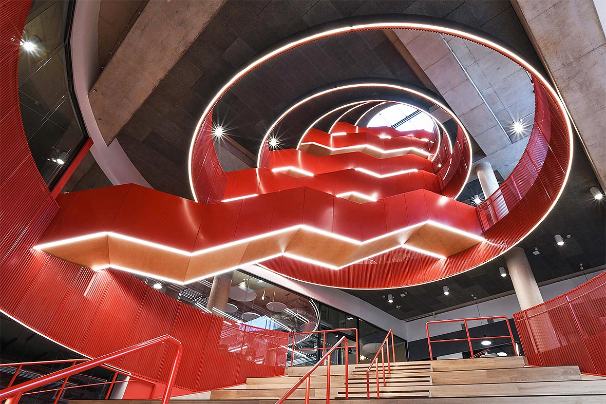
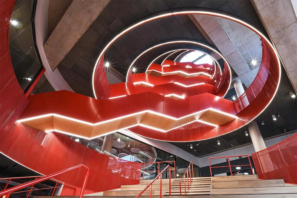
At Cardiff University’s new centre for innovation and creativity, the bright red powder coated staircase makes a real statement of intent. It is bold, exciting and innovative in itself.
Importantly, colour never exists in isolation. Texture, gloss level and surrounding materials all influence how a colour is perceived. A matt charcoal finish absorbs light and appears understated and solid, while the same colour in a gloss finish will be sharper and more reflective. Metallic finishes introduce another dimension entirely, changing character as sunlight moves across the façade.
Architectural colour is therefore not simply about selecting a shade from a colour chart; it is about understanding how colour, light and material combine to create an overall experience.
For decades, psychologists and designers have studied the influence of colour on mood and behaviour. Although many popular claims have been overstated, there is broad agreement that our surroundings can affect how comfortable, relaxed or stimulated we feel. (Smith & Demirbilek, 2010)
Healthcare environments are increasingly using carefully balanced colour palettes, curated with the intention of reducing anxiety and creating reassurance. Colour used in educational buildings attempts to encourage concentration while avoiding over-stimulation. Residential developments use warmer, more domestic colour schemes to provide a sense of belonging rather than institutional uniformity. (The role of colour and Voronoi patterns on wayfinding performance and anxiety in a virtual healthcare environment, 2026)
At Powdertech, we are frequently involved in detailed discussions concerning the colour, gloss level and texture of powder coating finishes in these different scenarios. For the state-of-the-art cancer centre at Jacksonville Hospital, Florida, the teams involved in the project design adopted a holistic approach, ensuring that all aspects of the design, both exterior and interior, reflected the goal of creating a positive, calm and caring environment focused on the individuals who inhabit it, namely the patients, their families, and the staff. In keeping with the use of colour and materials to create a calming feeling of warmth and comfort, a suitable Powdertech Wood Finish™ was specified for solar shading around the exterior of the building.
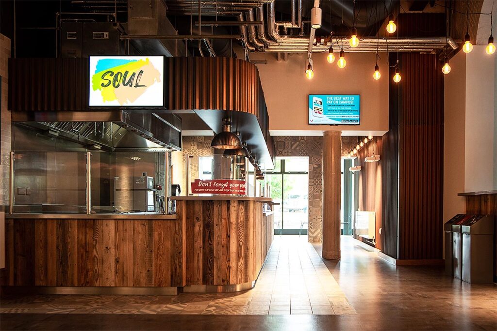
For refurbishment of the ‘Campus Kitchen’ at Leicester University, the designers wanted an ‘edgy,’ contemporary feel that distinguished this area from other parts of the campus. And the décor needed to reflect the styles and trends of the Millennial and Gen Z occupants. Various shades from our Rust collection were considered, the final choice being ‘Firebox.’ Our Rust finishes replicate patination/rust on metal, achieved through using stable polyester resin systems.
Equally important is variety. If buildings rely entirely on neutral tones, they can appear or monotonous and unwelcoming. On the other hand, excessive use of bold colours may become tiring over time. Successful colour design achieves balance, creating visual interest without overwhelming the user.
Colour contrast plays a vital role in helping people move confidently through buildings. Doors that clearly contrast with adjacent walls are easier to identify. Handrails that stand out from their background are simpler to locate. Contrasting stair nosings improve safety by making changes in level more obvious. (Manandhar et al., 2022, pp. 1265-1278)
These considerations are particularly important for people with visual impairments, reduced contrast sensitivity and some forms of dementia, but they improve usability for everyone.
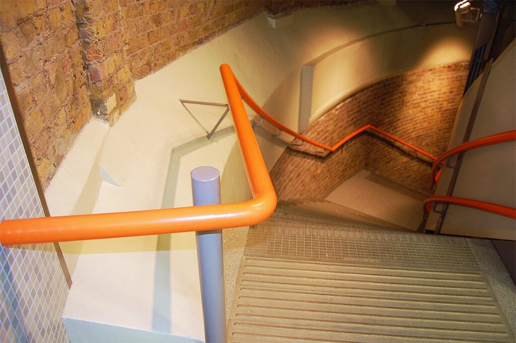
Guidance within Approved Document M (a UK government building regulation document giving practical guidance on how to make sure buildings are easy to access, enter, and move around for everyone) recommends a minimum 30-point Light Reflectance Value (LRV) difference between adjacent critical surfaces. (Access to and use of buildings: Approved Document M, 2024) By selecting colours with appropriate differences in LRV, architects can achieve the levels of contrast recommended within accessibility guidance, helping create buildings that are easier and safer to use. (Fallatah et al., 2020)
Colour can also become an instinctive navigation system. Carefully planned colour schemes can reinforce orientation more easily than signage alone. This technique is often used in hospitals, schools and commercial buildings. (Min & Ha, 2021, pp. 1420-1434)
Distinctive colours can identify individual floors, define circulation routes or create recognisable destinations within larger buildings. Residents and visitors begin to associate colours with locations. (Prandi et al., 2021)
Successful colour schemes rarely exist independently of their surroundings. Local materials, landscape, climate, neighbouring buildings and historical background all influence how colour should be used. A palette that feels entirely appropriate in an urban commercial district may appear out of place within a rural village or conservation area. (Xue et al., 2025)
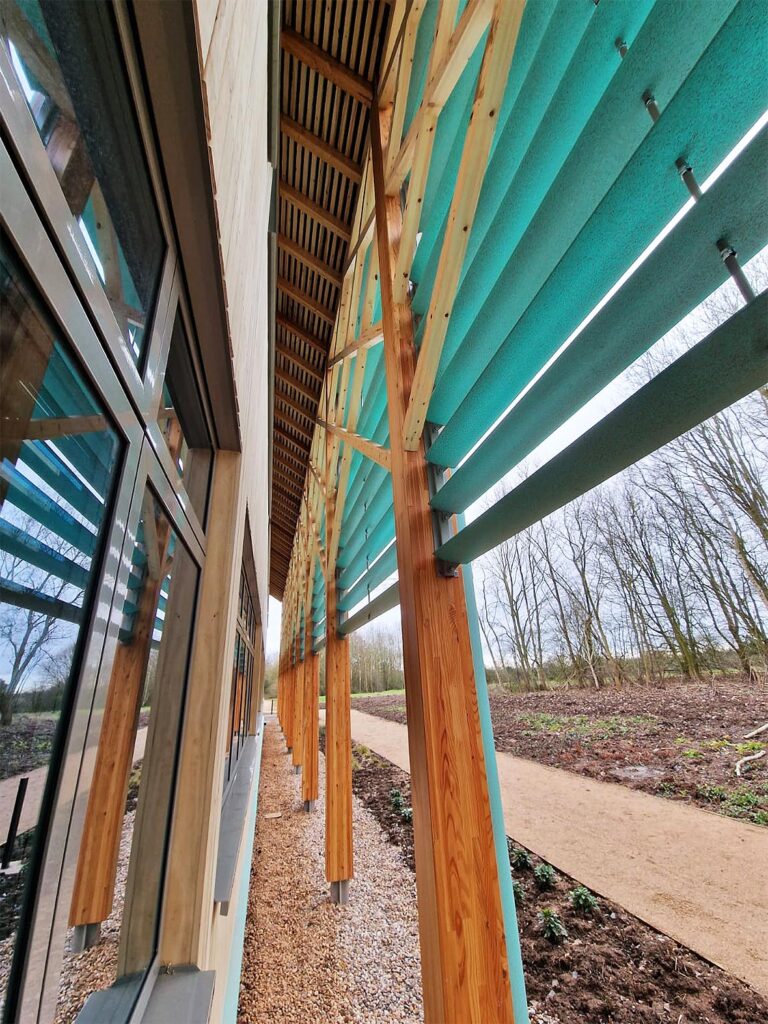
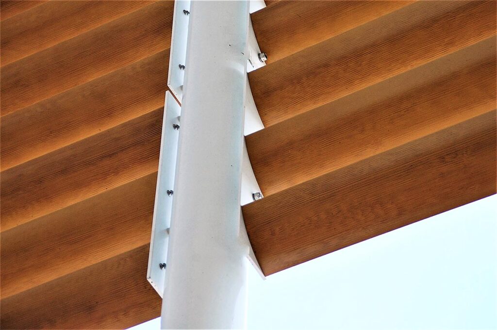
The designers for Microsoft’s premises in Warwickshire focused on creating a building that would be in tune with both its rural surroundings and the inventive and artistic profession of the occupants. The design of the building is based on a large barn with contemporary wooden paneling and external posts and beams. Running alongside these posts and beams are aerofoil solar shading fins and weather louvres. The powder coating colour chosen for these needed to complement the rural surroundings and also make a statement. Powdertech ‘Copper Mine’ was chosen, a textured finish that gives a pleasing variation in shade as sunlight moves across its surface. The effect of these blue/green aerofoil fins set against the wood is stunning, as the images show.
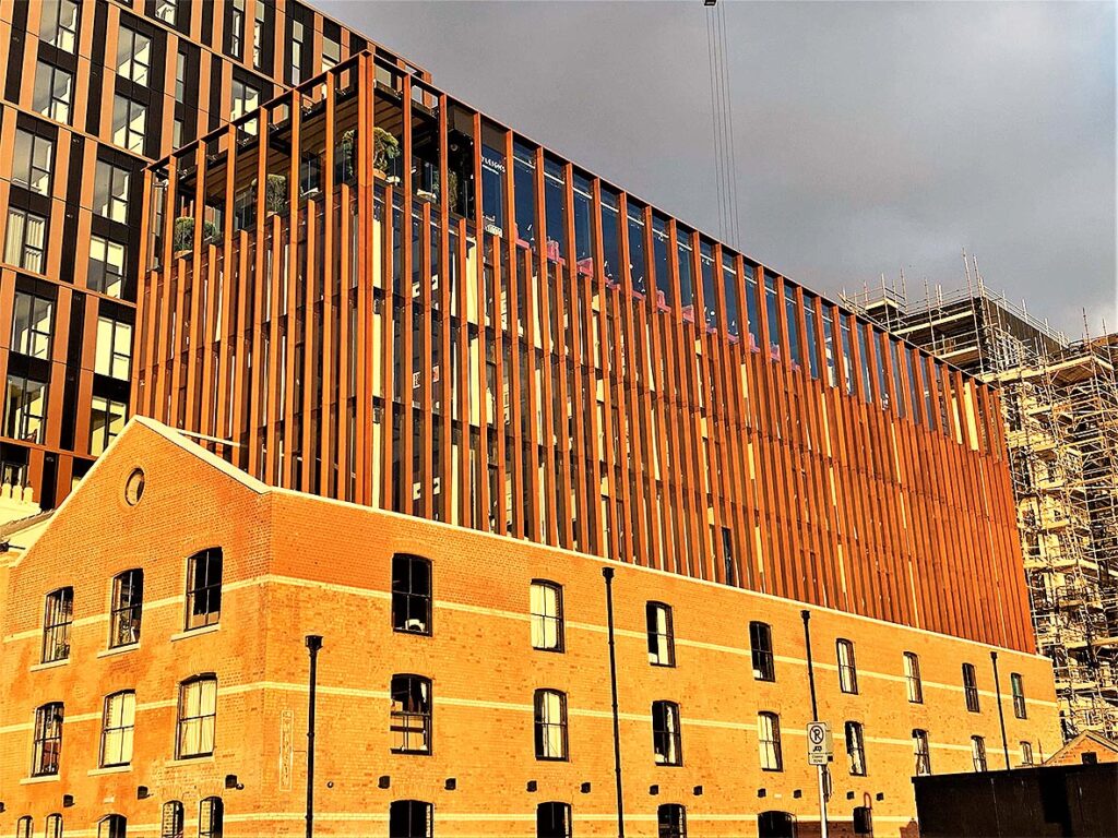
On Dublin’s North Wall Quay, The Mayson, a new boutique hotel in Dublin’s regenerated Docklands, was developed from two protected buildings – a traditional dockers’ pub and a 19th century timber warehouse.
A critical aspect of the design was to restore and knit the two buildings together. Powdertech’s patinated finish ‘Sahara’, met three design objectives. The rusted appearance preserved the industrial heritage. The colour harmonised with the red brick of the buildings and finally, the colour changes which occur across the textured surface depending on the light, look particularly stunning in full sunlight.
Rather than blending or harmonising with the background, colour can reinforce local identity by standing out from the crowd. Contemporary architecture can sit comfortably alongside traditional buildings when colour is used thoughtfully to establish harmony rather than competition. (Odetti, 2023)
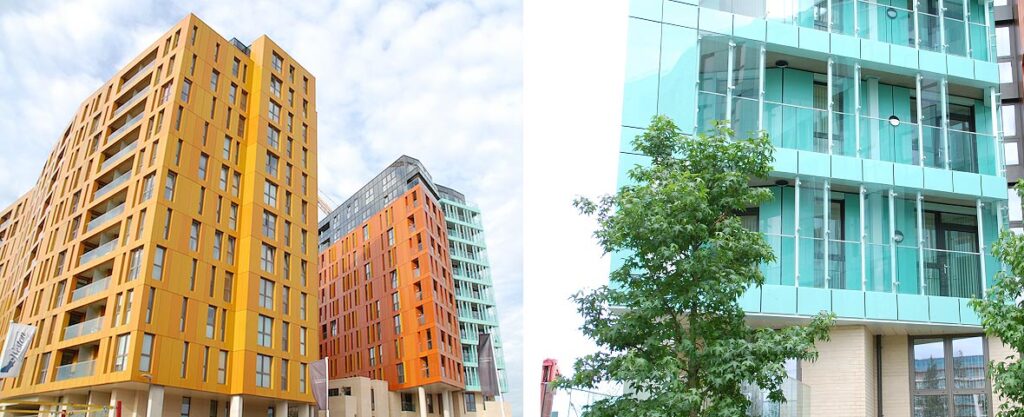
At Enderby Wharf, a development near historic Greenwich, the architects planned to do just that – to establish a colourful identity – as these images show. Powdertech was commissioned to coat over 4500 linear metres of galvanized steel balcony supports and glass balustrade supports for the residential apartments. Five different powder colours were used, all made to order by AkzoNobel.
A distinctive colourful approach at Enderby Wharf – coated by Powdertech Corby.
Enderby Wharf: Galvanized steel for balcony supports and glass balustrade support, coated by Powdertech Corby.
Colour selection should not be separated from the coating performance.
The longevity of colour depends not only on the pigments used, but also on the performance of the coating system that protects them. High-quality powder coating systems, for example, are designed to preserve both colour and finish, ensuring that the architect’s original design intent endures for decades. (Rossi et al., 2020)
Architectural powder coatings have been formulated to perform throughout years of exposure to ultraviolet light, rainfall, pollution, abrasion and everyday use. A colour that fades prematurely or shows excessive staining may undermine the appearance of an otherwise well-designed building. Coatings must also conform to the all-important reaction to fire rating A2, s1-d0. (Fire protection of ultraviolet-aged intumescent coatings containing polyhedral oligomeric silsesquioxanes, 2020)
Architects increasingly consider colour within a whole-life framework. Alongside aesthetic impact, they evaluate long-term performance: durability, colour retention, resistance to weathering, ease of cleaning and maintenance requirements all influence the lasting value of a specification. (Zhang et al., 2010, pp. 1-14)
A coating that maintains its appearance for many years reduces maintenance costs, minimises disruption to occupants and extends refurbishment cycles. Viewed over the life of a building, this offers economic and environmental benefits. (Antimicrobial and self-cleaning coatings in building engineering: Materials, mechanisms and long-term performance for low-carbon environments, 2026)
Colour will always be the final flourish, but it is far more than decoration. It shapes how buildings are perceived, influences how people feel within them, and adds to the long-term performance and value of the built environment. Few architectural design tools combine aesthetic, psychological and technical benefits so effectively.
References and further reading:
Architecture Today, May-June 2026. Designing for living. In conjunction with Dulux Trade.
Approved Document M
BS 8300-2:2018 Design of an accessible and inclusive built environment. Buildings – code of practice
**Nexus Journal of Cross-Disciplinary Insights, Vol2. No.1 2026 ‘The Integration of Colour Psychology in the Construction Industry: A multidisciplinary review from Architectural, Civil Engineering and MEP Perspectives.